
BY
DATE
July 2020
CLIENT
Concept Project
ROLE
Branding, Art Direction,
Packaging, Graphic Design


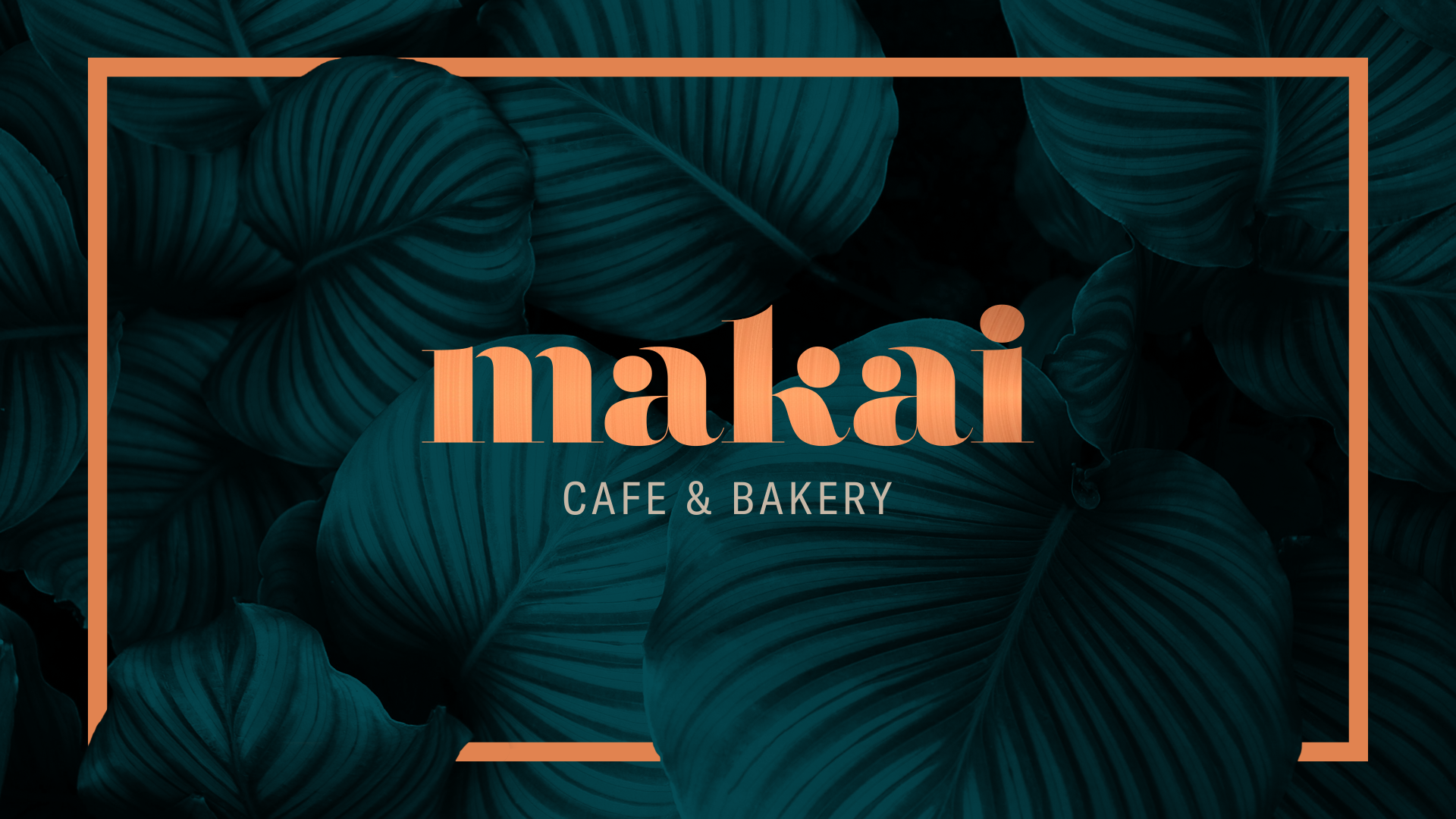
BEHIND THE WORDMARK
Makai is Hawaiian for “towards the water.”
The ultra thick decorative wordmark is nostalgic of iconic Hawaiian signage. The smooth full-bodied serif adds a sophisticated touch to cater to the brand’s ethos.
The ultra thick decorative wordmark is nostalgic of iconic Hawaiian signage. The smooth full-bodied serif adds a sophisticated touch to cater to the brand’s ethos.
The stems of the ‘m’ letterform look like two waterfalls descending to its final destination, the ocean.
The tapering at the top of the ‘a’ letterforms, the ball terminals and the curves are reminiscent of the perfect formation of crests in ocean waves.

The objective was to create a natural, earthy and inviting feeling to the establishment; an escape from the city, while drawing from natural elements of Hawaii.
Dark teal: A deep blue-green, draws from both the ocean and the tropical forestry in Hawaii. It’s the perfect color that combines both elements: earth and water. Green, representing earth, evokes a feeling of rejuvenation and optimism. While blue, representing the ocean, evokes a feeling of calm stability. Both qualities are reflected in the elegant deep teal.
Copper: Copper, evokes rustic luxury to bring a feeling of the familiar. It’s a warm and inviting color. Where possible, metallic foiling should be used.
Beige: A flexible, neutral and calm color. It helps to neutralize the dark teal and copper.


